THE ART/FASHION DIVIDE
Cindy Sherman’s landmark campaign for Comme des Garçons still holds an edge
by Jade French
When fashion and art collide in the right way, the results can be a symbiotic dream, a dialogue between aesthetics and process. From Yves Saint Laurent and Andy Warhol to the Keith Haring Foundation and Tommy Hilfiger, collaborations have come fast and furious. But none are more intriguing or surreal than Rei Kawakubo’s work with Cindy Sherman for Commes Des Garcons. This union was so much more than the one dimensional placement of an artist’s design onto clothes, the advertising campaign was unconventional to say the least, generating a blueprint of how the fashion world can shake itself up.
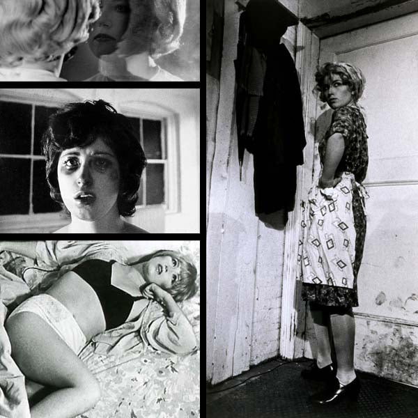
Untitled Film Stills, 1977–1980
Cindy Sherman is best known for her Untitled Film Stills that feature sixty-nine black-and-white photographs of the artist posing in various stereotypical female roles.
The high street is no stranger to collaboration. We’ve seen Kate Moss and Rihanna curate and design collections. However, the message that defines these partnership is commerce over innovation, sales over anything else. Of course, celebrity ventures into fashion are a little different to bringing an artist on board. The celebrity provides an endorsement rather than artistic expression. But it does go some way to show how the high street demystifies the catwalk. Mass production and high street reproductions of catwalk trends have come to define our style, inhibiting innovation and our ability to conceptualise anything outside of the norm.
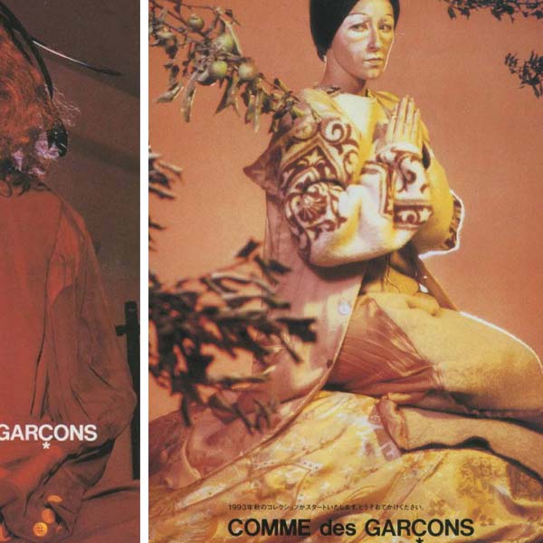

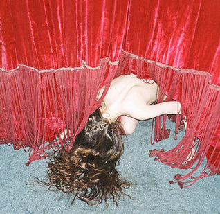
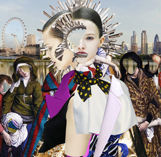
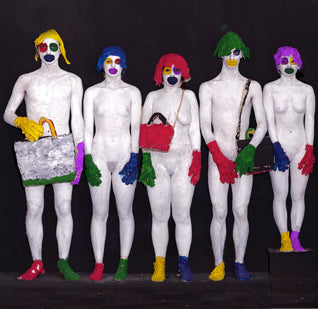
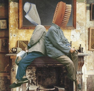
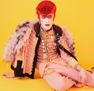
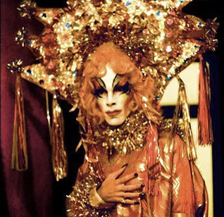
Encouraged by Kawakubo's avant-garde fashion sense, Sherman created a campaign equally unique. The persona's of her Film Stills are replaced by unhappy and flawed female characters that you don’t typically see in fashion magazine spreads.
Commes Des Garcons have long been the darling of the avant-garde. Kawakubo’s daring design and futuristic outlook established the label as innovative trend-setters, black was no longer de rigueur for the art set. Therefore collaboration with Cindy Sherman, another art darling, seems like the perfect move. Sherman’s conceptual portraits utilise aesthetic trends and costume in order to create alter-egos. As an artist she has tackled reconstruction of the representation of women head first in her work. What better way to confront the issue of woman’s position in cultures of representation that through a fashion campaign?
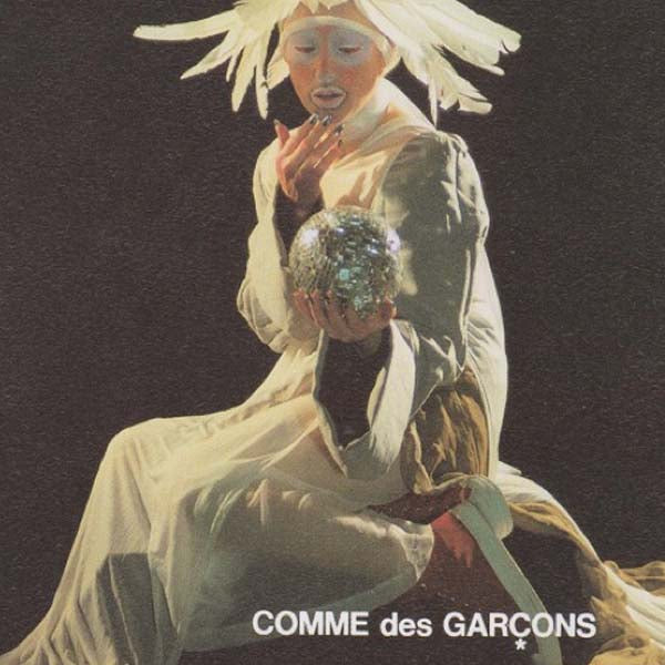
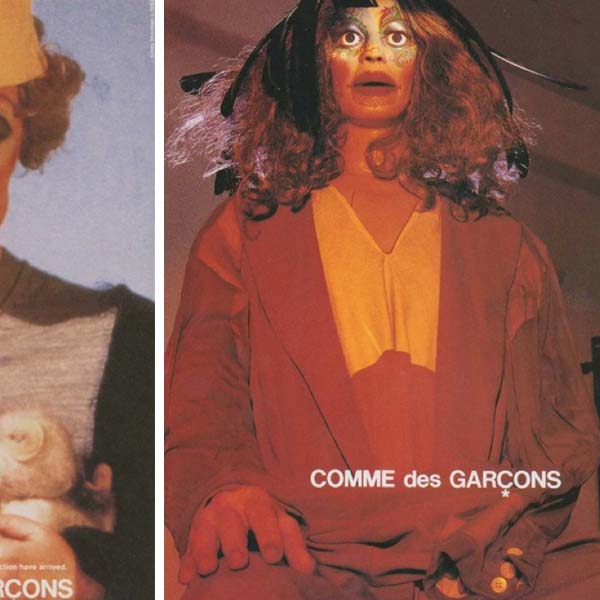
These photographs confront the consumer with a model that isn't particularly ideal; she floats in isolated contemplation, caught forever pensive in Sherman's frame.
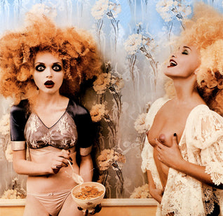
In ’95, Dazed magazine placed Rei Kawakubo “at the forefront of sensationalism”. But, Cindy Sherman’s work goes beyond mere sensationalism. It is shocking, raw and thought-provoking. A fan of deconstructionism, Commes Des Garcon’s clothes have frayed seams and deliberate holes, their editorials have never been sleek, glamorous or polished. Sherman embraced this aesthetic and took it one step further, deconstructing the whole genre of fashion advertising and the photo-shoot. The postcards produced for the campaign present no information other than the name of the designer; instead we are confronted with the twisted, ethereal image of woman. Instead of glossy, it’s grotesque. Stretched faces stare out from under heaped make-up. The styling draws our attention away from the clothing and focuses it onto the concept. Controversially, the artist makes no obvious concession to the brand. And in turn, the brand is given a legitimising boost from wholeheartedly embracing the artist.
However, just because Sherman shuns a traditional approach to fashion photography, doesn’t mean she’s is asking us to reject it completely. No stranger to fashion, she had worked with the likes of Diane B and French fashion house Dorothée Bis. Both of these commissions were unsettling in their relentless disregard for the usual fashion aesthetics. The models appear exhausted and scarred, bloated and fragmented. Her work for Commes Des Garcons draws on these motifs, as well as engaging with questions of Orientalism and othering. Packing a political punch is no mean feat in a fashion shoot, but Sherman successfully created a dialogue about imperfections, distortions and authenticity that today’s Photoshop enthusiasts might want to think about. Sherman asks how can we recreate fashion in an artistic language, rather than calling for us to destroy it completely.
As Gap embrace normcore and Urban Outfitters are accused of stealing the work of young designers, the high street is falling into the trap of unoriginality. Maybe it is time to revisit Sherman’s unique ’94 in order to highlight what a collaboration between fashion house and artist could look like? Bold, brash and startling the onus is put on the viewer to decipher the advertising message in order to make a consumer conclusion. It becomes a choice between the manifest grotesque or the impossible perfect. A difficult choice, but the strange beauty of Sherman’s work makes us more curious about product than any static high street campaign could do. It proves success comes from innovation, a gauntlet the fashion worlds need to embrace once again.


